More and more people are using mobile devices to access the web. Why does that matter to you?
Your Customers Care
Increasing numbers of your customers use mobile devices, not only to look at information, but to buy things using those devices. For example, 37% of US iPhone Users are Buying via Mobile.
If your site isn’t friendly to mobile devices, your potential customers may go elsewhere. Even existing customers may be tempted by the web sites of your competitors.
Apps Can’t Do Everything
Your web site needs to work with mobile devices. Smaller companies, and those that don’t regularly interact with their customers online via their mobile devices, may not even have an app. People who want to find out more about the company or the products will still need to use your web site, so it had better work well with mobile.
Even if every company offering a product or service had an app, your potential customers would still need to access the web. There is a finite amount of memory and screen space on a mobile device, so if a consumer doesn’t have your app on their phone, they’ll go to the web.
Google Cares
 Google is making it easier for people using mobile devices to identify web sites that are mobile-friendly. They announced on November 18 that they’re starting to roll out a “mobile-friendly” label which will be “rolling out globally over the next few weeks.”
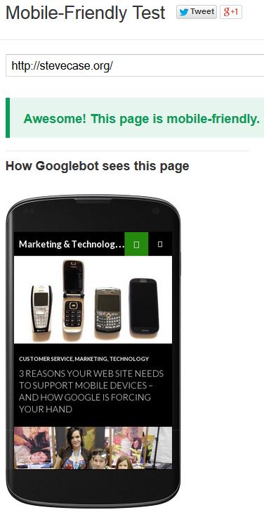
You can check your own web site (or anyone’s for that matter) using their Mobile-Friendly Test. If your site doesn’t pass the test, the site will even provide suggestions on how to improve mobile device compatibility.
As you can see, this site passed the test. That’s great news for those who visit the site now using mobile devices, and it will be easier for others to find the site as Google rolls-out the “mobile-friendly” label in their mobile search results.
Tip: Make sure the “How Googlebot sees this page” image correctly reflects what your site looks like on a smartphone. One test for this site failed after some page changes had not yet fully propagated to the Googlebot.
Responsive Design vs. Separate Mobile Web Site
Are you convinced now that your web site needs to be mobile-friendly? Great! There are two main approaches.
- Some web sites automatically detect a mobile device and redirect it to a separate mobile version of the web site. This allows for a mobile experience that’s very much like an app, but doesn’t require the customer to dedicate memory and screen space to installing one.
- The other approach is to use a single web site, but use a responsive design that works and looks good whether your customer is using a phone with a small screen or a computer with a large display.
Have your checked your web sites yet?
Which approach are you taking? Please share in the comments below!

Great Blog Site
You make a good point on this one. A lot of people nowadays are reliant on their mobile devices when checking a website. So having a mobile version of your site is a win win situation of both the site owner and visitor.
Thanks Cynthia. I’m guessing that means your site is mobile friendly, either adaptive or by using a separate mobile site.